Let's Organize Substack!
Part 2 of my Substack series for Authors: Make Your Newsletter stand out!
In part one, we talked about branding your Substack. If you need help with logos, wordmarks, and your colors—that’s where you should start.
Now we are going to look at your Substack homepage and the options for layouts.
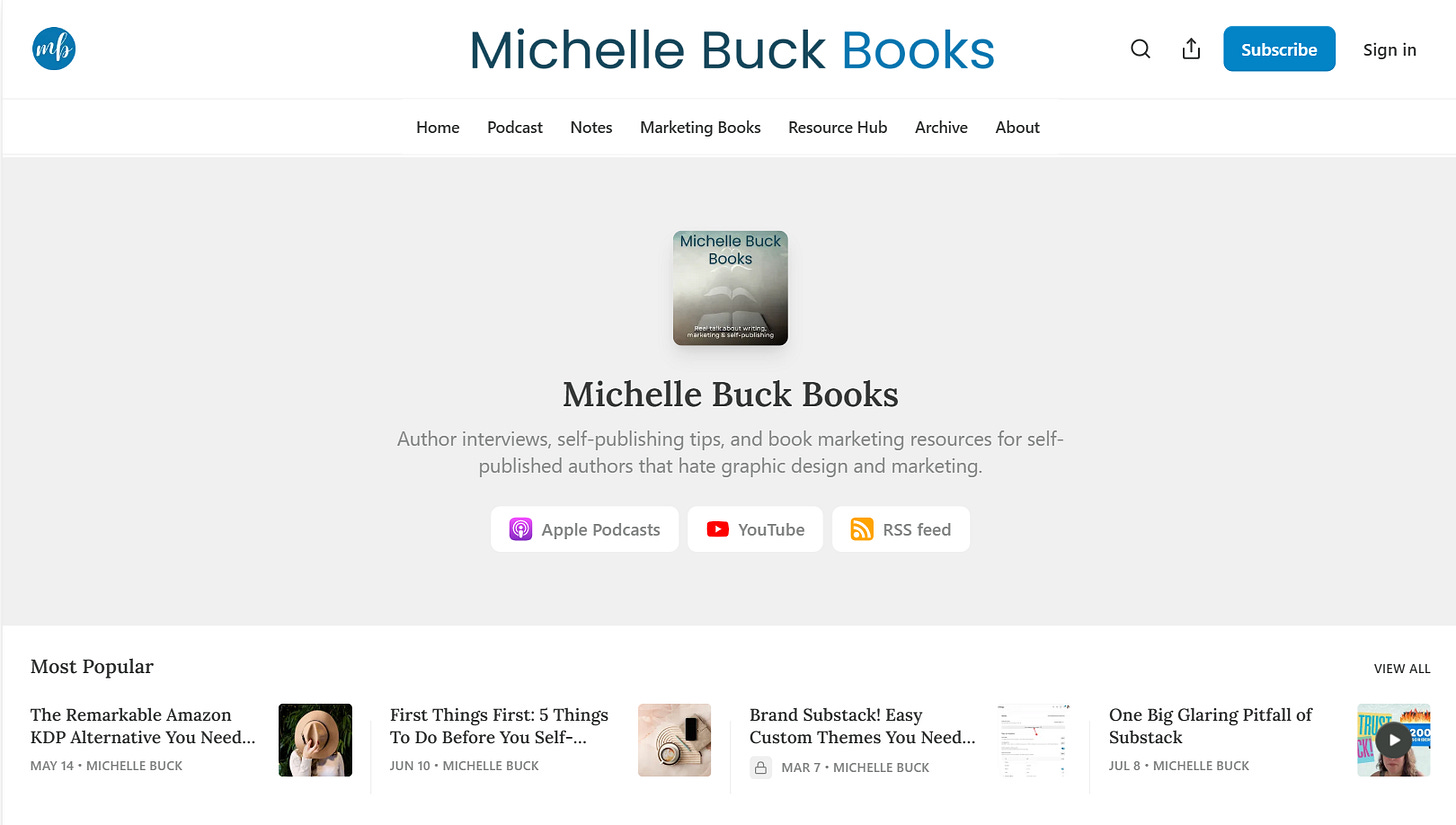
If you don’t know what your homepage is, let’s start there. When you set up your newsletter publication, the homepage is where your posts, podcasts, videos, links, and other content “live”. In addition, you also have a navigation bar that sits at the top of the page.
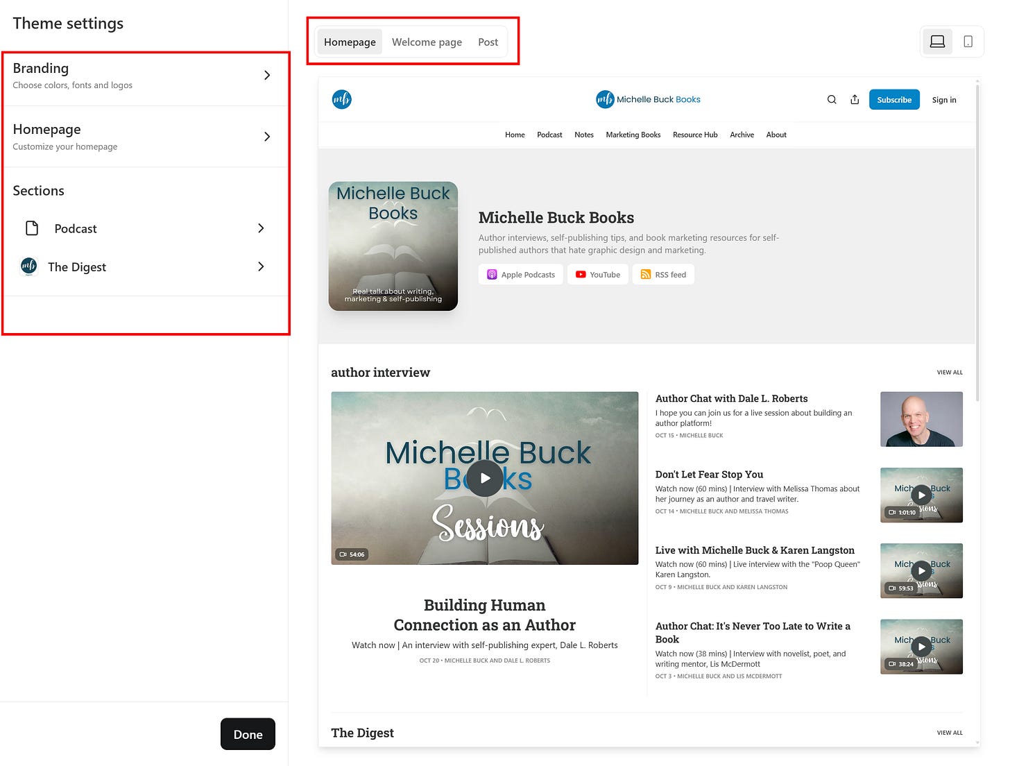
To edit the content here, we’ll start by looking at layouts. From your publication dashboard, click on Settings like you did for the last tutorial. On a desktop, click your profile image to show your notes. Then click on your publication link. You’ll see the stats for your publication with a list of options on the left. Find Settings down at the bottom of the page. From here, click Website and open up the website theme editor.
On the left, open up Homepage by clicking on the arrow.
Let’s explore how to make your Homepage irresistible.
There are really two sections here: Intro and Advanced Layouts.
Let’s focus on the Intro section, which controls what appears “above the fold” (what readers see without scrolling).
The elements you can update are shown - header style, alignment, show podcast players, and show top posts. Toggle these off and on to see what they look like on your homepage. You can turn them off if you don’t like them.
The header style is one to pay attention to in this section. You’ve got several layout options:
Feature: Shows your recent or pinned posts, perfect for highlighting your Hero post (a pinned post offering a lead magnet for signups)
Newspaper: Displays three pinned posts and five top posts, giving a classic news feel
Magazine: Showcases five of your most recent or pinned posts for a visual impact
Highlight: Features your single most recent or pinned post prominently, with three recent posts on the side
Media Feature: Puts your most recent post and headline front and center
Podcast: For the audio creators, showcasing episodes and optional links to external podcast players
You can play around with these options to see which one you prefer.
The Power of Pinning
Many of these layouts use pinned posts, which brings us to an important question—how do you pin a post?
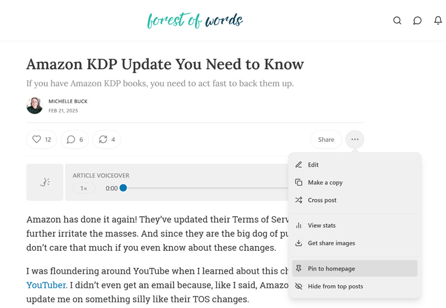
Simple! Find the post (can also be a podcast too) you want to feature, click the three dots next to “Share,” and select Pin to Homepage. This keeps your most important content visible to new visitors, no matter when it was published.
To unpin a post, you can go to your archive or find the exact post and remove it in the same way.
Tip: To exclude posts from the Most Popular section, select “Hide from Top Posts” in the three-dot menu of an individual post.
Below the Fold: Advanced Layouts
Now let’s talk about what happens “below the fold,” or as I like to call it, “the stuff people will see if they don’t find you annoying.”
Substack Posts View Options
You’ve got four main ways to display your posts:
List - For those who prefer a nice, orderly world where everything is in a tidy row. Marie Kondo would approve.
Grid - For the visual thinkers who believe text should be arranged in pretty boxes. Think: Instagram.
Feature - Highlight a tag you use often or add a section to your layout.
Subscribe - Make it easy for readers to subscribe to you.
You can add up to 10 content blocks and mix-and-match them. You can play around with what you like best.
Let’s look at each one briefly. Each of these elements are added when you click on Add a Block and select the type of block you want.
Lists
This is just like it sounds - a list of blog posts. You can make your home page look like an old school blog with a running list of your recent posts. In addition, you can also add sidebar content. These are called modules and you can add more than one. You can add recommendations, your other newsletters (if you any), or podcast episodes. Personally, I don’t like how this looks so I don’t use lists but play around with it and see if it’s something you’d like.
FYI - to remove any of these blocks, just click on the 3 dots to the right and click Remove.
Grid
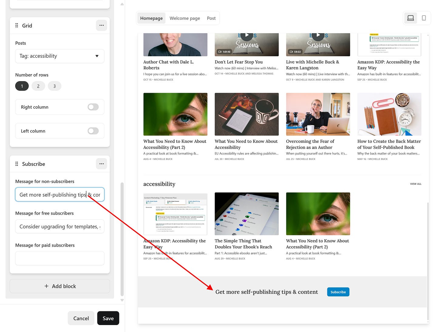
The next option is a grid. Set up recent posts, a specific tag, or even sections (we’ll talk about in the next post) in a grid layout. You can also add sidebar content here like in the Lists feature.
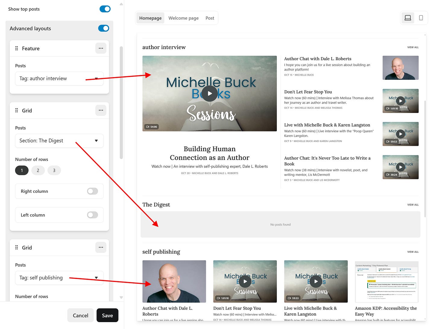
In the image, I have used tags and sections for my grids. I set up a new block for each one and then select the tag or section I want to highlight.
You might be wondering about tags.
Tags are set up when you create posts, before you publish, and are useful for categorizing your content. For instance, “author interviews,” “self-publishing,” and “author platform” are a few I use.
You can also add or edit the ones you have in the Settings area, under Website. Scroll down to custom tags to add or remove tags. Tags are also used in the Featured grid layout.
Featured
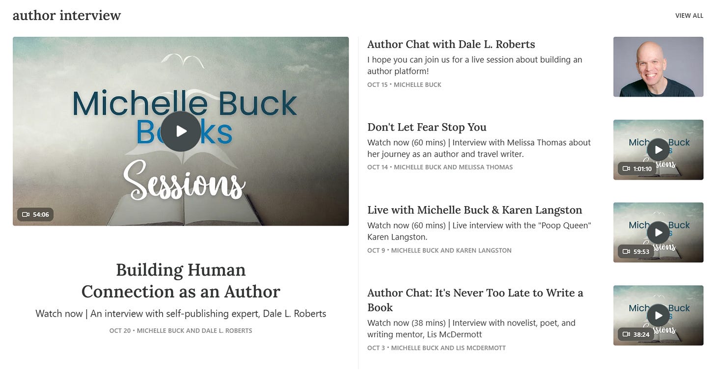
Featured is a bit different in that it has a larger image of your post or podcast that gets “featured”.
In the above image, notice the large image and text that highlights the most recent post for the tag, “author interview.” That’s really the only difference of this grid layout.
For these grids, you can also adjust the number of rows or add right or left columns.
Back to the Website Editor and Advanced Layouts though, you’ll pick which tag(s) or section(s) you want to showcase. Your chosen categories will appear alongside recent posts below the fold. It’s like having little neighborhoods in your content town.
You can mix and match tags and sections like you’re creating a content cocktail. Each tag or section will cozy up before the “Recent Posts” row.
Subscribe
This one is straight-forward. You can select this option to have your subscribe button show up based on the audience: not subscribed, subscribed, or paid. This allows you to customize the message for each.
Using Columns
Choose List or Grid, and you’ll unlock the option to add left or right columns. Fill these with:
Contributors - Show off posts from your publication’s “public” contributors. Great for making your solo publication look more collaborative.
Links - This is where you remind everyone you’re not just a Substack writer. List your books, social media accounts, or other noteworthy sites.
Podcasts - For when your written words weren’t enough and you needed to talk, too.
Recommendations - Where you showcase other Substacks you love. It’s like telling your readers, “If you think I’m good, check out these people who are probably better.”
Subscribe - Another chance to subtly ask for subscribers.
Substack Themes
Experiment with different layouts to see which one best showcases your unique content. Since your homepage is often a reader’s first impression of your work, make sure it stands out, or at least is user-friendly.
Next time, we’ll dive into Sections and how they can help organize your publication.


